The date displayed through a window is probably one of the most common complications you’ll find on a watch. From inexpensive quartz watches to high-end mechanical timepieces, it is practically everywhere. And why wouldn’t it be? Knowing the date is useful, after all.
But things are never quite that straightforward in the wonderful world of horology, are they? Despite being such a simple and practical feature, the humble date window has somehow managed to divide the watch enthusiast community.
Of course, this is hardly a new debate. The subject has been discussed countless times in watch articles, forums and online threads. But I still wanted to throw my two cents into the conversation. And while we’re at it, perhaps recommend a few watches from microbrands and independent watchmakers that, in my opinion, have managed to get the date window just right.
Personally, I like to divide watch enthusiasts into three categories: those who love date windows, those who appreciate them only under certain conditions, and those who would rather not see a date window on a watch at all.
And here’s the interesting part: as a watch enthusiast, I have actually belonged to two of these three groups at different stages of my journey.
Before I Became a Horology Addict
In my previous life — and by that I mean before I decided I was going to become a full-blown horology enthusiast — I loved date windows. Why wouldn’t I? It felt like they added something extra to the dial, making it more engaging. They were practical, and, perhaps most importantly, they made me feel like I was getting more watch for my money. Another function for the same price? I’ll take it.
And I suspect plenty of people who simply enjoy wearing watches, without necessarily calling themselves watch enthusiasts, feel exactly the same way. A date window tells you the date. What is there to complain about?
But hey, that was my previous life.
Then came the phase when I properly dedicated myself to horology. My afternoons were suddenly filled with reading Hodinkee and Fratello instead of scrolling through Facebook. My YouTube algorithm began serving me watch reviews and endless watch-related content instead of travel videos, wildebeest crossing the Maasai Mara or bears catching wild salmon at waterfalls. (Yes, I love animal videos.)
And somewhere along the way, something happened. The opinions of watch writers, collectors and the wider enthusiast community started to weigh on me. I began noticing things about date windows that had never bothered me before. I had been influenced!
I never became a complete date-window hater, though. I still like them — when they are integrated well. Give me a design where the date feels like it belonged there from the beginning, and I am perfectly happy.
But there is another group of enthusiasts who would rather do away with the date altogether. My fellow TimepieceNook author Sebastien Gorvel belongs firmly in that camp.
Why Do Date Windows Get So Much Hate?
So, what exactly did the humble date window do to deserve all this hate? Let’s look at the most common complaints.
It breaks the symmetry. A watch dial is often designed around balance and symmetry, and a small cut-out at 3, 4:30 or 6 o’clock can easily disrupt that harmony. This is particularly noticeable on minimalist, dress or field watches, where a clean and balanced dial is often a big part of the appeal.
It Replaces an Hour Marker. A date window positioned at 3 o’clock often comes at the expense of the hour marker, which is either shortened or removed altogether to make room for it. The same can happen at 6 o’clock. When the rest of the hour markers are perfectly arranged, having one missing or awkwardly squeezed into a corner can be surprisingly distracting.
The colours often don’t match. Many watches use a white date wheel with black numbers on a coloured or black dial. And that bright little square stands out.
It is useless. For some enthusiasts, the date window is simply unnecessary. They hardly ever check the date on their watches, so why compromise a beautifully designed dial for something they barely use? And if you own several watches and rotate between them regularly, chances are the date will be wrong whenever you pick up a watch that has been sitting in the watch box for a few days. Having to correct it every time can quickly become more of a nuisance than a convenience.
It Doesn’t Look Cohesive With the Rest of the Design. Sometimes, it feels as though the date window just sits there, looking completely out of place compared to the rest of the dial. Instead of feeling like an integral part of the watch, the date window ends up looking like an afterthought. Typography is a good example of this. I’ve sometimes come across watches with beautifully designed numerals in a distinctive font, only to find a date window displaying numbers in a completely different, mismatched font. And just like that, the entire look of the dial is spoiled!
And the list goes on. The date window is too big, too small, not framed, or simply in the wrong place. The complaints never seem to end! But you know what? They do have a point. Most of these criticisms are perfectly valid. In many cases, a watch would genuinely look better without a date window than with a poorly implemented one.
So, What Makes a Good Date Window Implementation?
Watch designers have plenty of valid reasons for making certain decisions when it comes to date windows. But if you’re going to include one, why not make sure it is implemented well?
Simply cutting a hole in the dial and exposing the date wheel underneath can sometimes feel like a rather lazy approach. But in my opinion, there is no single answer to what makes a good date window, either. Ultimately, a good date window isn’t necessarily about following a particular set of design rules. It’s about making the date feel like an intentional part of the watch rather than something added as an afterthought.
And here’s the interesting thing: none of the problems we discussed earlier are necessarily problems in every situation.
Take the size of the window, for example. A well-proportioned date window, perhaps with an attractive frame or carefully bevelled edges rather than a simple, straight-edged cut-out, can look perfectly at home on a dial.
The same goes for symmetry. A watch dial doesn’t always have to be perfectly symmetrical to look beautiful. In fact, sometimes a little asymmetry can make a design far more interesting. It all depends on how the different elements work together.
And what about positioning? I’ve seen date windows that look fantastic at the traditional 3 o’clock position, but also at 4:00 or 6 o’clock. In my opinion there is no single position that guarantees a good or bad design.
Even the much-debated colour of the date wheel isn’t necessarily a problem in every situation. Yes, a colour-matched date wheel often helps create a more cohesive appearance, but I’ve also seen watches where a contrasting date wheel works remarkably well. It depends on the situation, sometimes, that contrast can even become an interesting design element in its own right.
In a nutshell, the date window should complement the overall dial design rather than draw attention to itself.
A Few Watches With Beautifully Integrated Date Windows
Here you go! I’ve picked a few watches from microbrands and independent watchmakers that, in my opinion, have done a particularly good job of integrating the date window into their designs.
One thing worth mentioning before we get started: these are entirely my personal picks. What looks good to me might not necessarily appeal to everyone. After all, as we’ve already established, the date window is a surprisingly divisive little feature!
Doxa SUB 200 T.GRAPH II

The SUB 200 T.GRAPH II from Doxa features large white hour markers against a blue dial. The date window, positioned at 6 o’clock, complements these markers rather nicely. It is also framed, giving it a more deliberate appearance. Altogether, the date window feels well integrated into the overall design of the watch.
Tuseno Shellback V2

The Shellback V2 from the Swedish brand Tuseno features a sandwich-style dial, with cut-outs forming the hour markers. Those at the four cardinal positions have a rounded rectangular shape and are outlined by black borders. The date window at 6 o’clock follows the same design, blending in beautifully with the surrounding hour markers.
Nomos Tangente 38 Date
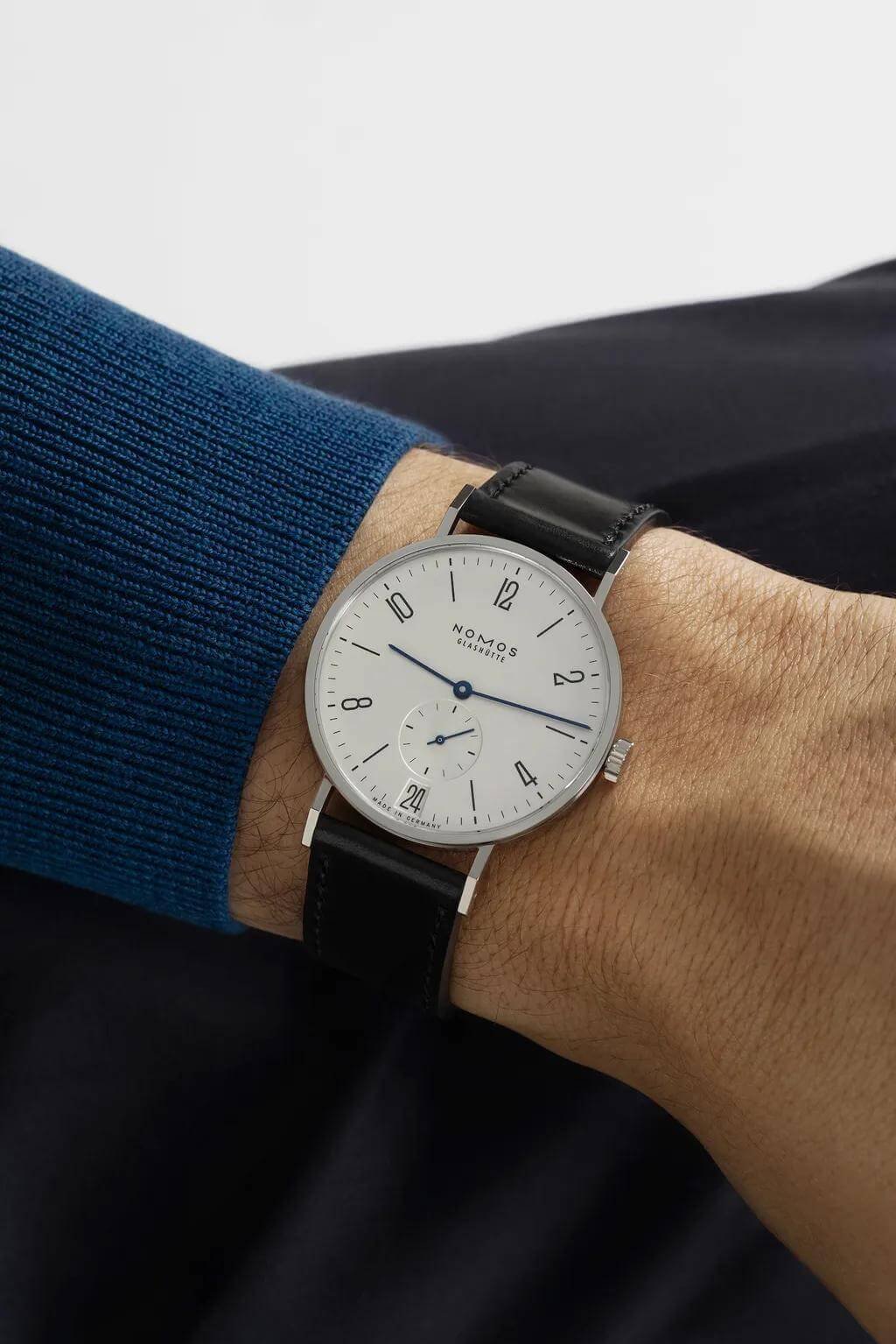
The NOMOS Tangente 38 Date is a dress watch featuring distinctive numerals for its hour markers. The trapezoidal date window at 6 o’clock is beautifully integrated into the dial, with typography that perfectly matches the hour numerals. Even the proportions are spot on, with both the window and the date numerals sized just right.
Laps Arche
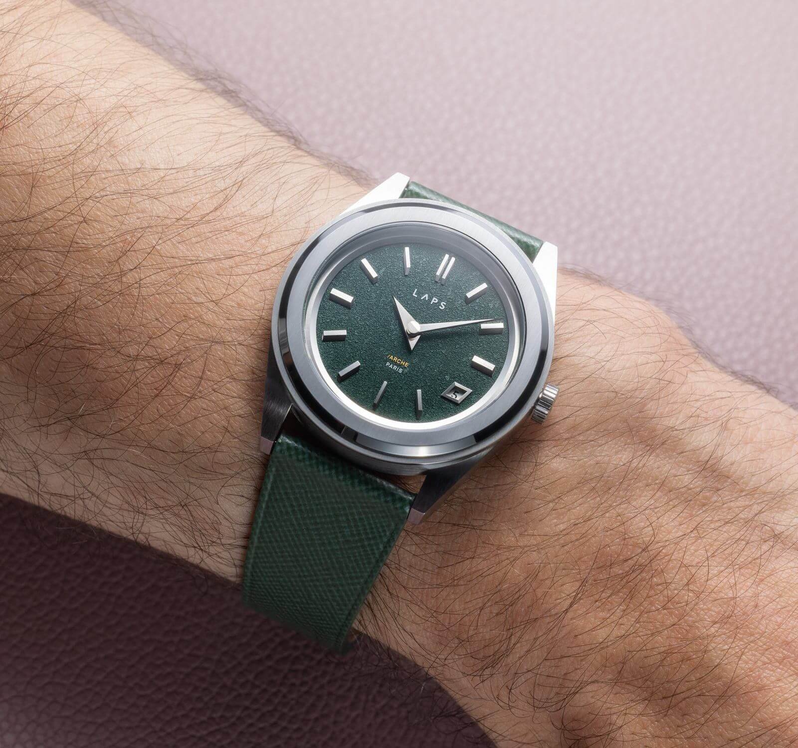
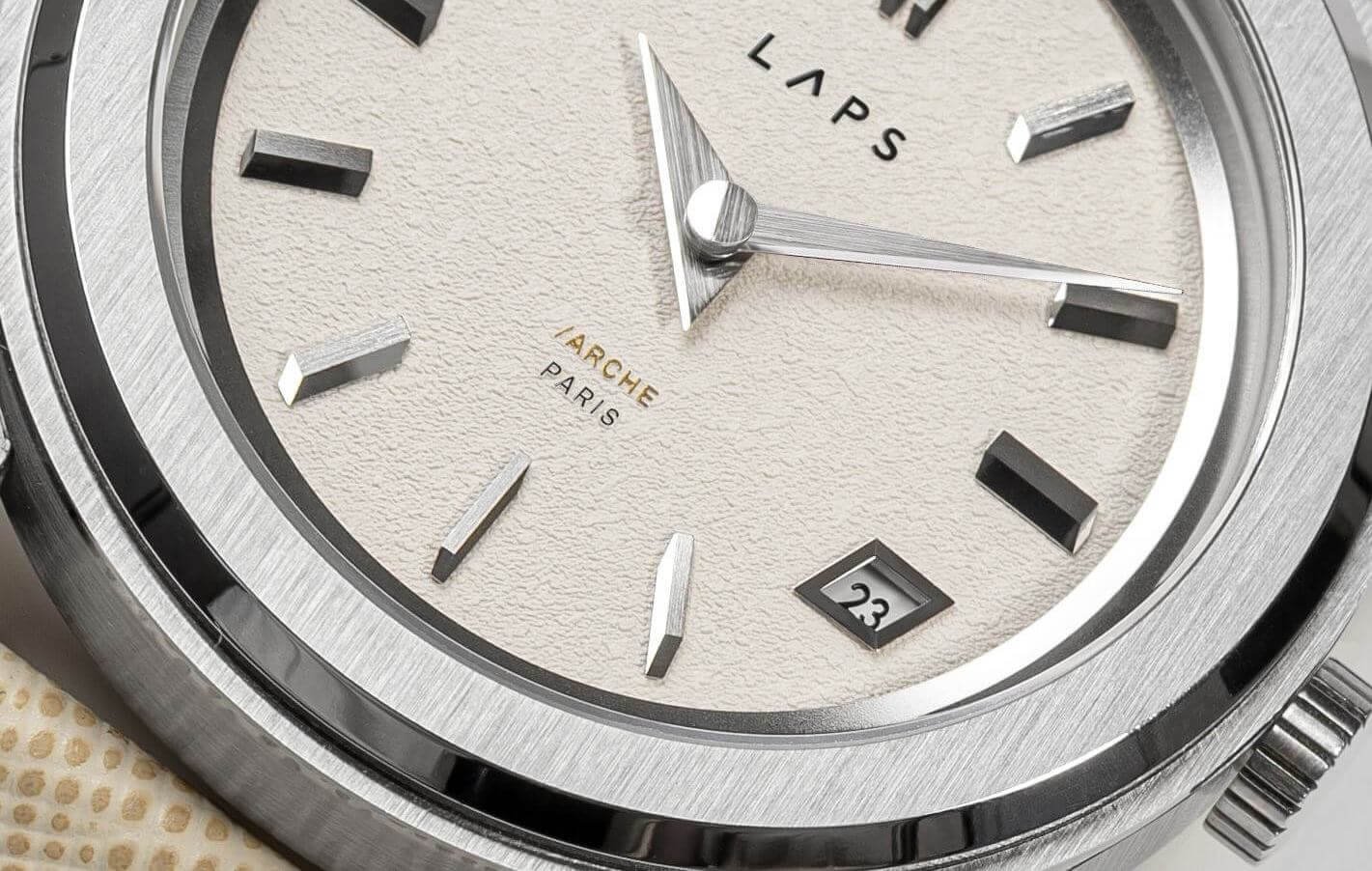
The Arche collection from the French brand LAPS is defined by its wonderfully unusual hour markers. The diamond-shaped date window at 4 o’clock follows the same distinctive design language, with decorative details that complement the surrounding indices. Rather than looking out of place, the date window feels like a natural part of the dial. We recently reviewed this watch on TPN. You can read our full review here.
Direnzo DRZ 02R
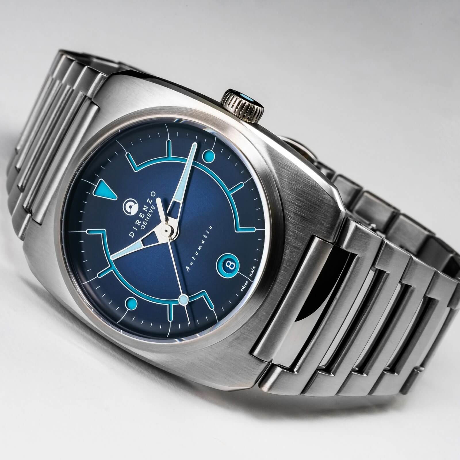
Another interesting take on the sandwich-style dial. The retro-futuristic design from Direnzo combines two shades of blue with white accents, creating a distinctive look. The rounded date window blends beautifully with the rest of the dial, while its positioning also helps maintain a pleasing sense of symmetry.